A Guide to the Warm Earthy Color Palette for Your Home

A lot of homes start the same way. The sofa works well enough, the wall color is fine, and the room is functional, but it doesn't quite feel settled. After a long day in Bellefontaine or anywhere around Logan County, many homeowners want something softer and more grounded. They want rooms that feel calm when the weather turns cold, welcoming when family drops by, and easy to live in every day.
That's where a warm earthy color palette comes in. These are the shades that borrow from clay, sand, wood, leather, stone, and late afternoon light. They don't shout for attention. They make a room feel steady, relaxed, and lived in.
That practical comfort is one reason earthy interiors keep showing up in real homes, not just in magazines. They also pair naturally with the kinds of pieces many shoppers already look for, from upholstered seating and bedroom furniture to durable office furnishings, a dependable mattress store Logan County, and even household staples like Speed Queen laundry for utility spaces that still feel intentional.
Table of Contents
- Why Warm Earthy Tones Feel Like Coming Home
- Understanding a Warm Earthy Color Palette
- Bringing Your Palette to Life with Texture and Light
- Customizing Your Furniture with Earthy Tones
- Applying the Palette in Your Home and Business
- Your Quick Start Guide and Next Steps at Tangers
Why Warm Earthy Tones Feel Like Coming Home

A room that settles people down
A common scene plays out in many homes. The family room has decent furniture, the layout isn't bad, but the space still feels chilly or disconnected. That usually isn't a furniture problem alone. It's often a color problem.
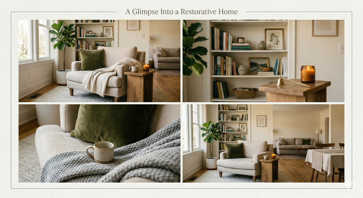
Warm earthy tones help fix that because they echo materials people already associate with comfort. Think terracotta pottery, wheat-colored linen, worn brown leather, oak floors, or the muted glow of clay brick. Those references feel familiar, and familiar spaces often feel easier to relax in.
For households trying to create a true retreat, the idea goes beyond style. It connects to the broader idea of creating healthy biophilic spaces, where homes borrow visual cues from nature to feel calmer and more restorative.
Practical rule: If a room feels sterile, adding warmth through color is often faster and easier than replacing every piece in it.
Why these colors feel familiar
Earth tones have a long history in interiors, but their staying power comes from how naturally they fit daily life. They're forgiving with shoes on the floor, pets on the rug, and changing seasons outside the window. They don't feel precious.
That's one reason they work so well with a home-centered approach like loving the space as a form of self-care. A room doesn't need to be formal to be beautiful. It needs to support the people living in it.
For many Logan County families, that means choosing a palette that can handle real life while still feeling pulled together. Warm sand on the walls, cinnamon on a chair, and a soft olive or deep blue accent can achieve that. The result doesn't feel trendy in a nervous way. It feels settled, which is often what people mean when they say a home finally feels right.
Understanding a Warm Earthy Color Palette

What makes a color earthy
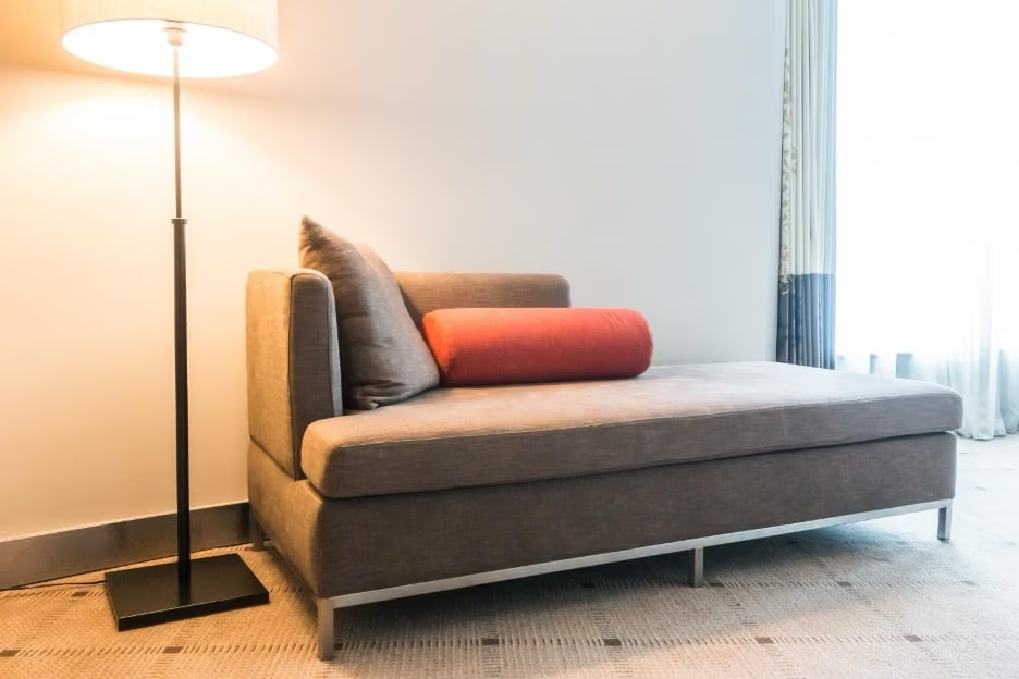
An earthy color is more than brown. It is a color softened with brown or gray undertones so it feels settled, natural, and easy to live with. In practical terms, that shift turns orange into terracotta, yellow into ochre, and red into rust or cinnamon.
A warm earthy palette works like a basket of garden produce instead of a row of highlighters. The colors still have personality, but they feel sunbaked, weathered, and grounded rather than sharp or sugary. That is why they tend to sit comfortably beside wood furniture, stone surfaces, leather, and woven fabrics.
Homeowners often notice this the hard way. A paint chip can look perfect in your hand, then feel oddly disconnected once it sits beside flooring, upholstery, and cabinetry. Usually, the issue is undertone. One color has that softened earthy cast, and another is cleaner or brighter. For readers comparing those pieces together, this Richmond homeowners' floor color guide is a useful companion because floor undertones have a subtle impact on everything around them.
A simple formula that keeps the room balanced
The easiest framework for building the palette is the 60-30-10 rule. Give about 60% of the room to a warm base color, 30% to supporting tones, and 10% to a cooler or darker accent. That mix keeps the room cozy without letting every surface blend into one warm blur.
A little contrast helps. Sage, muted blue, deep olive, or even a dusty charcoal can give your eye a resting place. If all the colors are equally warm and equally close in value, the room can start to feel flat, like a recipe that needs a pinch of salt.
A good earthy palette uses a small group of colors that share the same undertone family.
If you want a practical way to read those relationships in a real room, this guide on setting the mood with coordinated color walks through pairings in a clear, usable way.
A sample palette to picture
Here's a simple example that helps first-time decorators see how the parts work together:
| Role in the room | Color example | Hex code |
|---|---|---|
| Main wall or large upholstery | Sand | #D8C3A5 |
| Secondary fabric or rug tone | Terracotta | #CC7777 |
| Wood or leather companion tone | Cognac | #A54E2F |
| Accent textile or art detail | Ochre | #CCA500 |
| Trim or soft neutral relief | Cream | #F3E9D2 |
The key is the relationship between the colors. Sand sets a calm foundation. Terracotta and cognac add depth and warmth. Ochre adds energy in small doses. Cream lightens the mix so the room stays open and welcoming.
Shoppers around Bellefontaine often run into a very practical version of this problem. The sofa style is right, but the fabric leans too pink, too orange, or too flat beside the flooring already in the room. In earthy palettes, those small shifts show up quickly. That is one reason custom furniture and fabric choices matter so much at Tanger's. Adjusting the upholstery color, wood finish, or cushion fabric can turn a close match into a room that feels intentional from the start.
Bringing Your Palette to Life with Texture and Light

Texture makes earthy colors feel rich
Color alone won't carry this look. A terracotta wall and a brown sofa can still fall flat if every surface has the same visual weight. Texture gives earthy spaces their depth.
That's why natural materials matter so much here. In interior design benchmarks for 2026, warm earth tones are strategically layered with natural textures like wood, linen, and stone to enhance perceived spatial warmth and reconnect users with nature through chromatic resonance, according to this design trend discussion.
A few pairings work especially well:
- Linen with clay tones keeps terracotta or rust from feeling too dense.
- Leather with sand and cream adds age and richness without making the room dark.
- Wood grain with ochre or cocoa tones gives the palette a natural backbone.
- Stone, ceramic, or woven fibers help break up upholstered surfaces and painted walls.
Light changes the whole mood
Warm earthy colors also react strongly to lighting. Morning light can make sand feel cooler and cleaner. Late afternoon sun can turn the same color golden. In lamplight, rust and cinnamon often deepen.
That's why a room should never be judged by one swatch under one bulb. The same fabric can look balanced in daylight and too red at night. Window direction, lamp shades, bulb warmth, and even nearby flooring all influence the final read.
Rooms don't just contain color. They filter it.
A practical way to test a palette is to place materials together. Put the rug sample next to the wood finish, then hold the fabric beside both in daylight and at night. For more guidance on how lighting shifts what people see, this living room lighting article helps connect the design theory to real rooms.
A good earthy room usually mixes soft and firm surfaces too. If the sofa is a smooth fabric, a chunky knit throw helps. If the table is heavily grained wood, a smoother lamp base may balance it. That variety keeps the palette interesting without adding more colors.
Customizing Your Furniture with Earthy Tones

A common showroom moment goes like this. The sofa shape is right, the size fits the room, and then the fabric sample turns cold, pink, or flat next to the rest of your earthy palette. Warm earthy rooms depend on subtle undertones, so a close match often is not close enough.
Custom ordering helps solve that problem by letting you build the piece in the right order. You start with the furniture you need for the room, then choose the finish, fabric, or leather that supports the palette already taking shape in your home or business. That approach usually leads to a result that feels settled instead of pieced together from whatever happened to be on the floor that day.
The order of choices matters
The process works best when the big decisions come first. The custom furniture planning process described here explains why configuration usually comes before fabric selection. That order protects both comfort and appearance.
It helps to treat the process like building a meal. First comes the main dish, then the sides, then the seasoning. In furniture terms, that means:
Start with layout
Does the room need a sofa, sectional, loveseat, dining chair set, or accent chairs?Choose for daily use
Will the piece handle pets, children, waiting-room traffic, long evenings of TV, or occasional guests?Finish with color and material
Which earthy fabric, leather, wood finish, and cushion style fit the space you are creating?
This sequence prevents a common mistake. A homeowner falls in love with a cinnamon fabric, then tries to force it onto a sofa that is too deep for the room, too formal for the household, or the wrong scale.
What customization actually changes
Custom ordering provides more accurate results. In practical terms, shoppers can often adjust fabric or leather, wood finish, cushion feel, pillow fill, leg style, and sometimes the overall size or configuration.
That flexibility matters with earthy colors because small shifts carry a lot of visual weight. Rust can read spicy or muddy. Camel can feel clean and warm, or a little too yellow. Brown can look grounded beside oak and completely different beside espresso wood. If those distinctions feel fussy, they are easier to understand in person with swatches laid side by side on the actual frame style you are considering.
For anyone sorting through texture, wear, and color depth before visiting the store, this guide to upholstery materials and fabric choices can make the options easier to compare.
Custom work also asks for patience. Made-to-order furniture takes time because each choice affects what gets built, cut, sewn, and finished. For many shoppers, that wait is worthwhile because the final piece fits the room more naturally and stays useful longer.
At Tanger's Furniture, that process stays local and concrete. You can bring in paint samples, flooring photos, cabinet finishes, or a rug corner, then compare them against fabric and wood options with a design team that knows how warm earthy colors behave on real furniture, not just on a small swatch card. For homeowners and businesses in our area, that turns color inspiration into a piece that is customized for the room it has to live in.
Applying the Palette in Your Home and Business
Residential rooms that feel calm and usable
Earth tones gained significant mainstream popularity during the 1970s, coinciding with the environmental movement. Their resurgence in recent years validates their lasting appeal as instant classics in modern interiors, as noted in this earth tone history overview. That long life matters because it makes the palette a practical choice, not just a passing look.
In living rooms, earthy colors usually work best when the biggest pieces stay soft and grounded. A sand or mushroom sofa can support rust pillows, a cognac chair, and warm wood tables without feeling busy. In bedrooms, the same palette often becomes quieter. Cream bedding, an ochre throw, and a wood dresser can make the room feel settled instead of overly styled.
Dining spaces benefit from warmth too. Clay-adjacent wall color, wood tones, and simple textiles can make everyday meals feel more inviting. The palette doesn't need a grand room to work. It often looks strongest in homes where real family use matters more than formal perfection.
Warm earthy rooms tend to age well because they relate to materials people already trust.
For budget-conscious households, that makes a difference. Fewer dramatic color swings usually mean fewer regrets. The room can evolve with new lamps, rugs, and artwork without needing a full reset.
Commercial spaces that feel professional and welcoming
This palette also makes sense in business settings. A waiting room, office, or reception area can feel more comfortable when the colors are warm but controlled. Clients and staff usually respond well to rooms that feel grounded rather than stark.
A healthcare waiting room might use warm neutrals, wood, and soft upholstery to reduce that institutional feeling. A law office or financial office might lean into deeper wood finishes, muted rust, and structured seating for a steadier, more established impression. A small hospitality area can use clay and sand tones to feel welcoming without becoming casual.
For professional projects in Logan County, space planning matters just as much as color. A commercial room has to hold traffic, support cleaning needs, and still represent the business clearly. That's why the palette should be matched to durable furnishings, practical layouts, and finishes that hold up under regular use.
Readers exploring office updates can look at Commercial Office solutions for categories such as task seating, conference furniture, waiting room pieces, and planning support. The same earthy principles apply in both home and business. The difference is how the room needs to perform.
Your Quick Start Guide and Next Steps at Tangers
A simple plan for getting started
Effectively using a warm earthy color palette doesn't demand a full redesign. It requires a clear order of decisions and a little confidence.
A simple starting checklist helps:
- Start with one anchor piece. Pick the sofa, rug, or bed first. Let that piece establish the mood.
- Choose a dominant warm base. Sand, mushroom, clay, ochre, or cocoa all work if they stay muted.
- Add supporting warmth carefully. Bring in rust, cognac, cinnamon, or apricot through smaller upholstery and accents.
- Use one cool note for relief. Sage, teal, or indigo can keep the room balanced.
- Layer texture on purpose. Mix wood, woven materials, linen, leather, or ceramic so the palette doesn't feel flat.
- Test under real light. Look at samples during the day and in lamplight before making final decisions.
For readers thinking about a made-to-order piece, this custom order starting guide lays out the first steps in a helpful way.
Support that makes the project easier
Good design still has to fit real budgets and real schedules. That's where practical store policies matter. The Low Price Promise helps reassure value-minded families that thoughtful choices don't have to mean overspending. Flexible financing can also make a larger project more manageable, whether it's a living room refresh, bedroom update, office waiting area, or a stop at a local mattress store Logan County shoppers already trust.
Service matters after the purchase too. Professional local delivery handles the heavy lifting, setup, and placement, which saves time and hassle. In-house service requests also give customers a local point of contact if something needs attention later.
The same no-pressure approach applies across departments. A shopper may come in for Bellefontaine furniture, a bedroom set, a recliner, a home office update, or even Speed Queen laundry for a hardworking utility area. The goal is the same. Help people build spaces that feel better to live in.
Shoppers can also explore Living Room collections, review Financing options, and sign up for the Love Your Home Club for exclusive offers and practical ideas delivered over time.
Visit Tanger's Furniture showroom in Bellefontaine to see custom options in person or browse collections online to start the journey. Have a specific design question? Contact the design staff today or join the Love Your Home Club for expert tips delivered to the inbox.